Visualising multi dimensional data is critical in understanding the performance of portfolios. Our research was focussed on the most innovative ways by which the risk and return of portfolios can be visualised to make informed decisions about the portfolio.
Here we have a parallel coordinates, This is the most interesting as it allows very dynamic filtering and also shows all the ratios from a single view for all accounts.
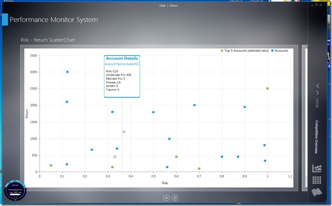
Mean – Variance scatter plot visualisation. Should look like the efficient frontier if the accounts are efficient
Top 5 and worse 5 accounts using a radar chart
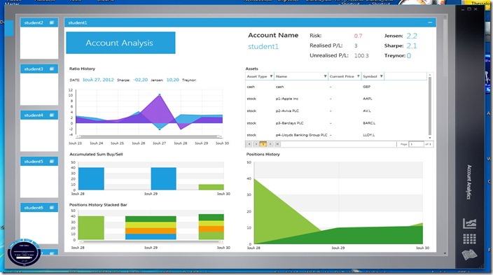
Portfolio history details over a period of time
Another view of the Portfolio Analysis over a period of time
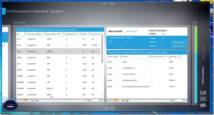
All Portfolios in a single view
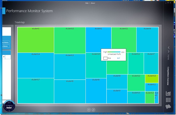
TreeMap visualization of all portfolios. Size for Risk and Shade of blue for return.
The visualization concepts have never been applied to portfolio theory!!!


No comments:
Post a Comment